Typography goes beyond just picking a font; it's an art form that really shapes how information gets across. Choosing the appropriate typeface (Note: "typeface" is the correct term, not "font.") is crucial when designing a website, crafting a logo, or undertaking a print project. This guide will explore the wide range of typography styles and offer advice on when to use them effectively.
Serif Fonts
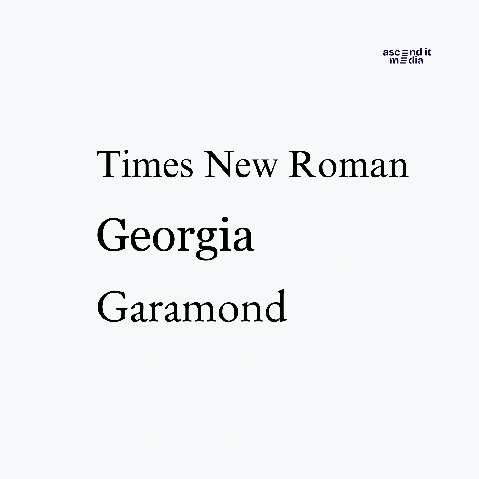
Serif fonts are identified by tiny ornamental lines or strokes at the tips of letters. They emit an air of established customs, strictness, and dependability. Below are a few examples of when serif fonts stand out:
When to Use:
- Printed Materials: Serif fonts are frequently utilized in publications, newspapers, and periodicals because of their ease of reading, particularly in extended blocks of text.
- Official Documents: Use serif fonts for official documents such as CVs, academic essays, and business letters to portray a sense of professionalism.
Examples:
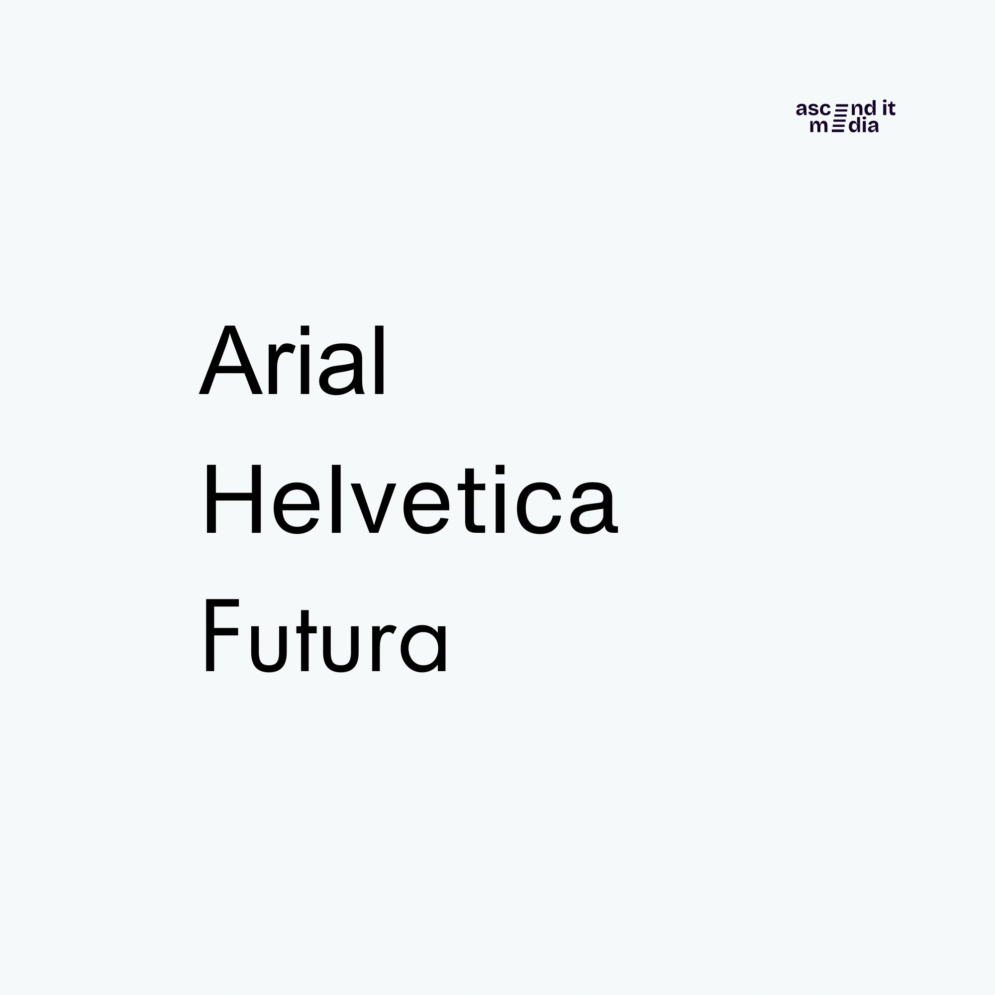
Sans Serif Fonts
Sans-serif fonts offer remarkable versatility and adaptability, making them perfect for various applications like digital interfaces, printed materials, signs, and branding initiatives. Their straightforwardness and clarity make them especially adept at effectively communicating information.
Ideal Usage Scenarios:
- Digital Platforms: Sans-serif fonts excel in legibility on screens, making them a top choice for websites, mobile apps, and digital presentations.
- Contemporary Design: Incorporate sans-serif fonts into modern design ventures like branding materials, ads, and product packaging for a sleek and up-to-date aesthetic.
Examples:
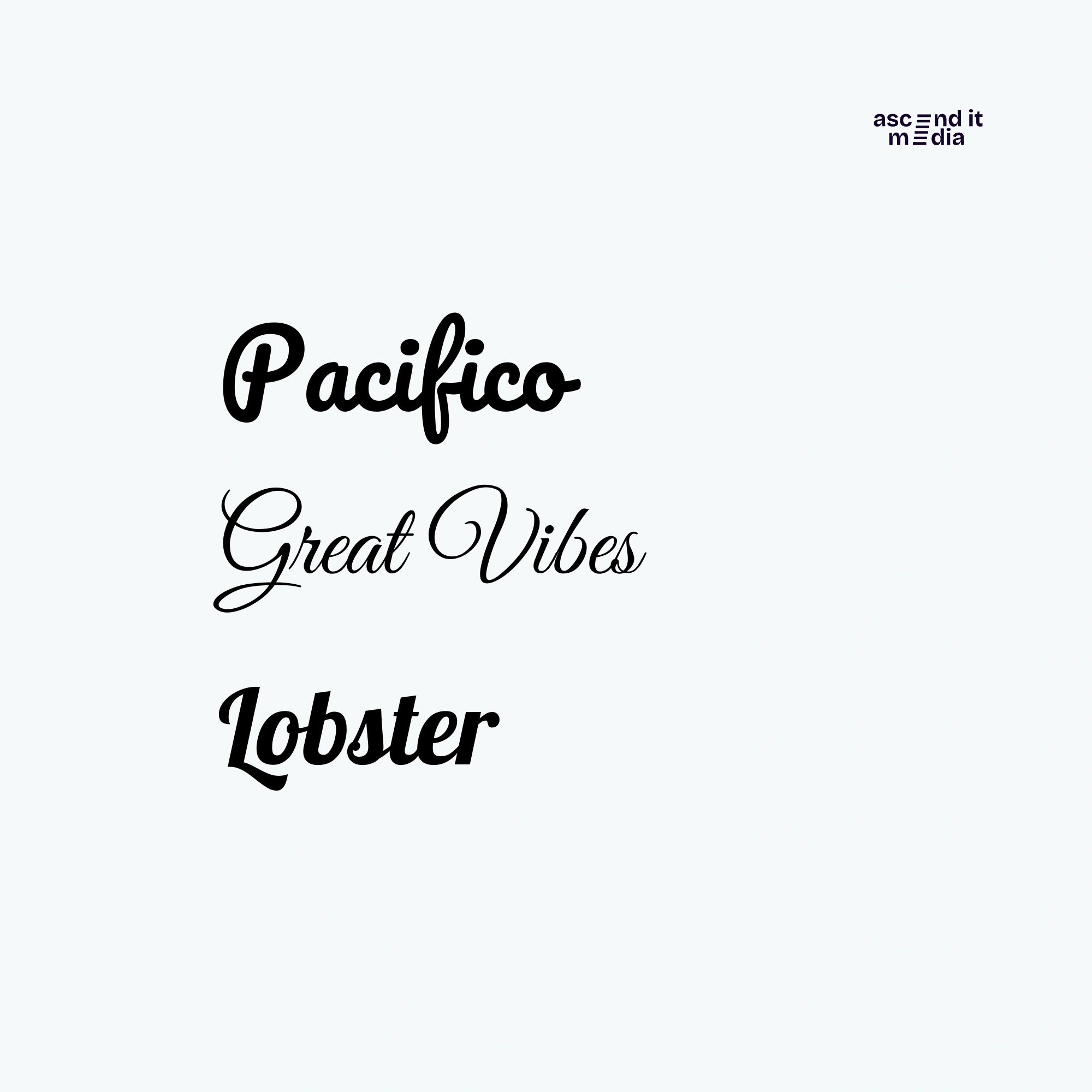
Script Fonts
Script fonts emulate the fluidity of handwriting, injecting designs with elegance, personality, and a dash of creativity. However, it's crucial to wield them judiciously and in suitable contexts:
Best Uses:
- Invitations and Cards: Script fonts elevate the allure of wedding invitations, greeting cards, and event announcements, imbuing them with grace and refinement.
- Logo Design: Integrate script fonts into logo designs to convey uniqueness and artisanal flair, especially for brands within the realms of fashion, beauty, and luxury.
Examples:
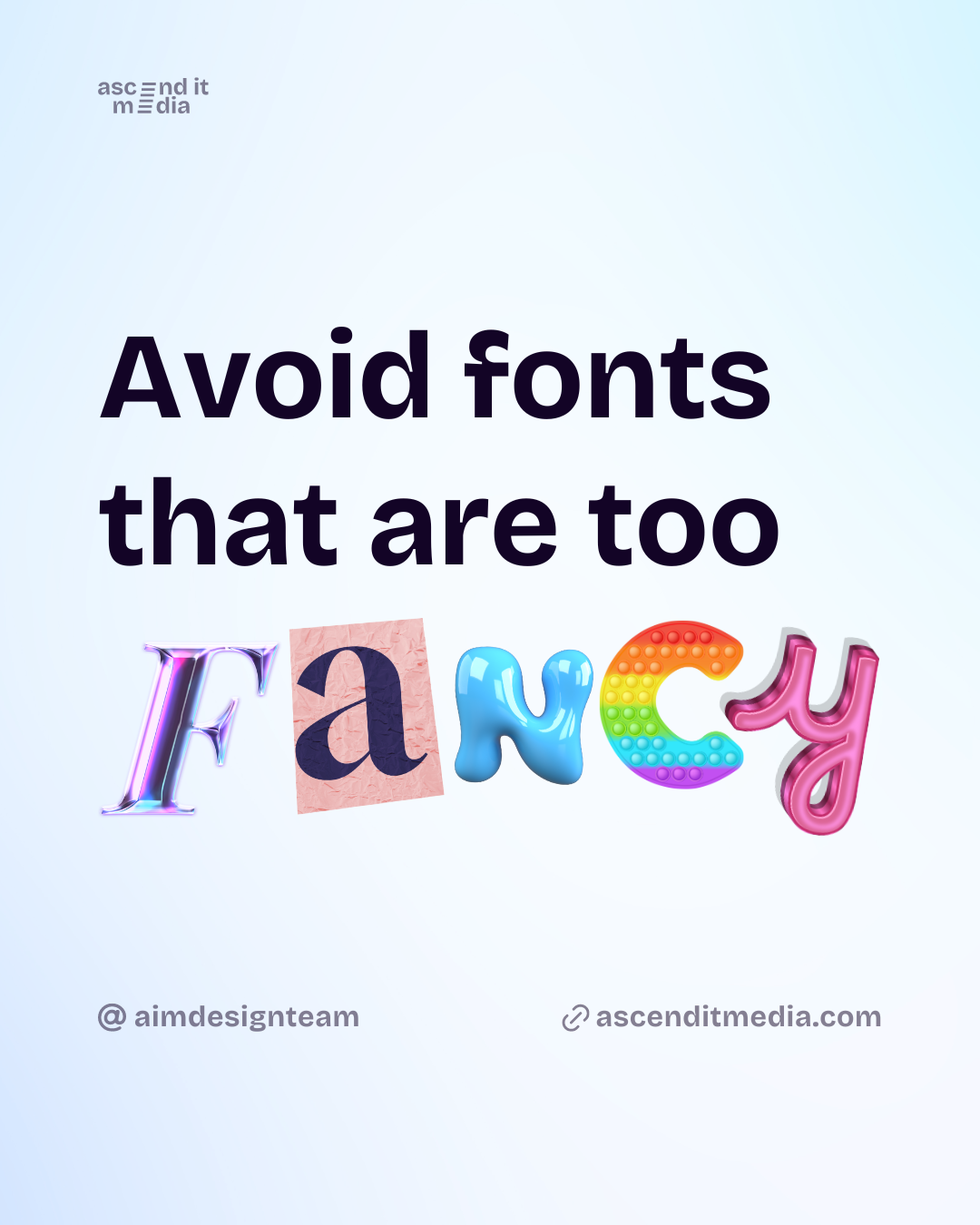
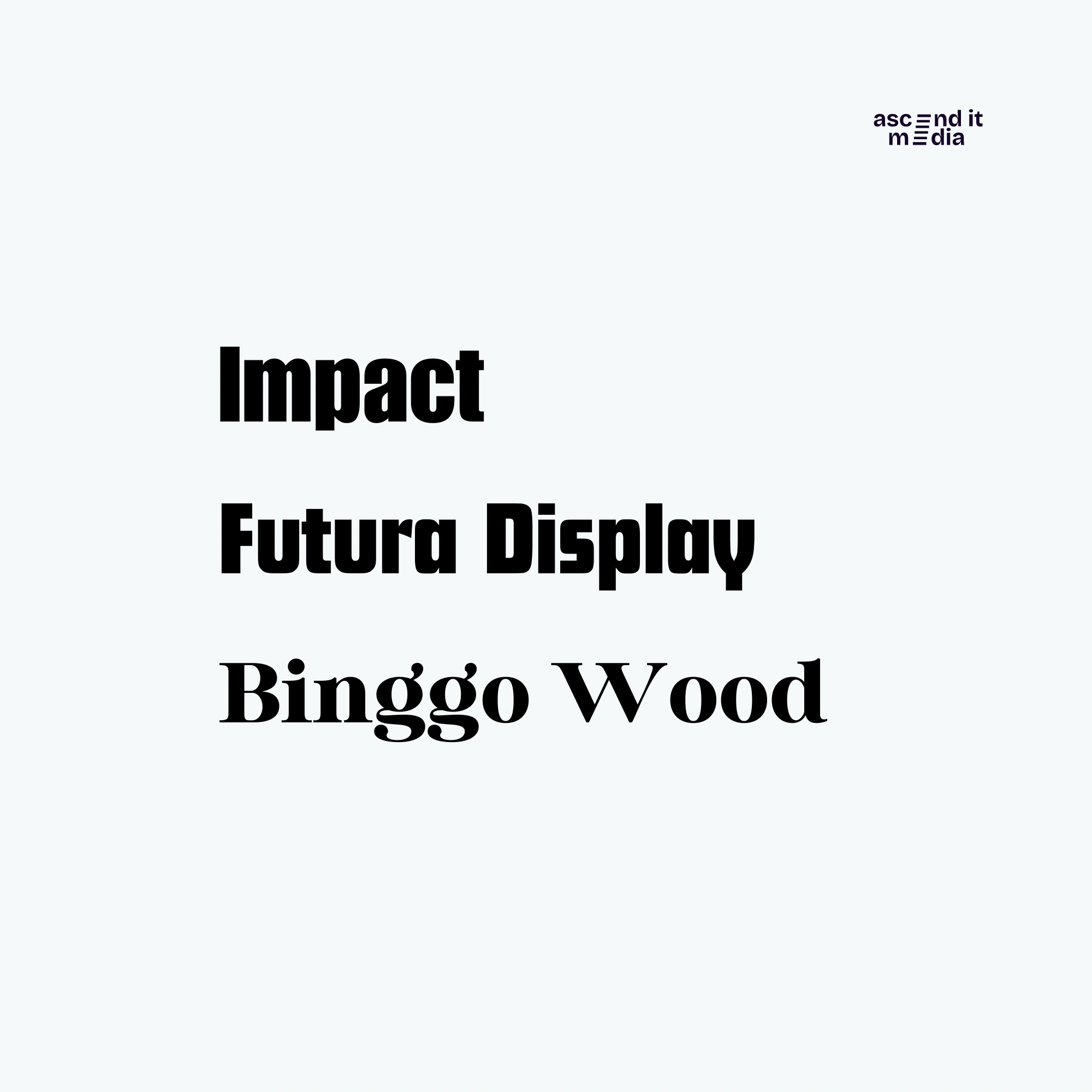
Display Fonts
Display fonts are bold, eye-catching typefaces designed for headlines, banners, and other large-scale text elements. They are meant to grab attention and make a statement:
When to Opt for Display Fonts:
- Headlines and Titles: If you want to immediately seize the reader's attention in headlines, posters, or signage, display fonts are the way to go. They add that extra visual punch and emphasis.
- Creative Ventures: Incorporate display fonts into your artistic or experimental designs, like album covers, movie posters, or promotional materials, to evoke a distinct aesthetic vibe.
Examples:
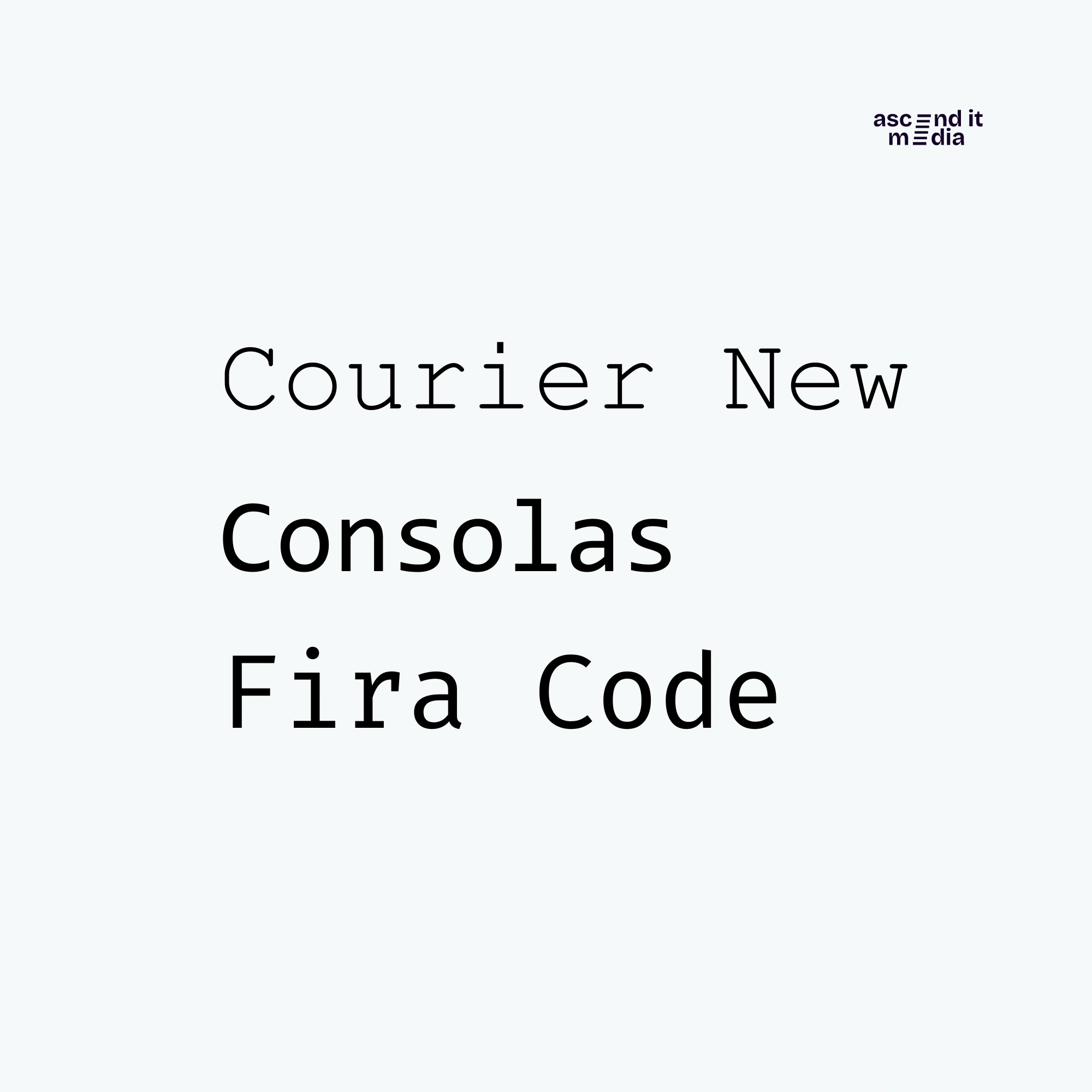
Monospaced Fonts
Monospaced fonts are those where each character takes up the same amount of horizontal space. They give a consistent look to text, resembling the old-school typewriter or coding style that many of us are familiar with.
When to Choose Monospaced Fonts:
- Coding and Programming: For coding and programming endeavors, monospaced fonts reign supreme. Their clear, aligned structure makes code much easier to both read and write.
- Technical Documentation: In technical manuals, instructions, or forms where precision in formatting and alignment is key, monospaced fonts are the ideal choice.
Examples:
Conclusion
Knowing the ins and outs of typography gives designers the tools to make smart choices that amp up communication and visual charm. When you grasp the quirks and uses of different fonts, you're better equipped to get your message across and snag your audience's attention. Play around with various typefaces, but never forget to think about the context and goal of your design to really hit the mark.