While it might be tempting to use fancy fonts to stand out from the crowd, there's a fine line between eye-catching and overwhelming. In this article, we'll delve into why it's essential to avoid fonts that are too fancy and highlight five brands that excel in using easy-to-read typefaces on their websites.
Google, the tech giant renowned for its simplicity and user-friendly interface, understands the importance of clarity in communication. Their website features clean, sans-serif fonts that ensure effortless readability across different devices and screen sizes. By prioritizing legibility over ornate designs, Google maintains a professional and approachable image that resonates with users worldwide.
.webp)
Apple
Apple's design philosophy revolves around elegance and sophistication, and their choice of fonts reflects this ethos. Whether it's on their website or product packaging, Apple opts for sleek and modern typefaces that complement their minimalist aesthetic. By steering clear of overly decorative fonts, Apple maintains a cohesive brand identity and delivers a seamless user experience that aligns with their premium image.

Wise
Formerly known as TransferWise, Wise is a fintech company known for its transparent and customer-centric approach to money transfer services. On their website, Wise employs simple yet effective typography to convey complex information in a digestible format. By using easily legible fonts, Wise instills trust and confidence in their users, fostering a sense of reliability and transparency that sets them apart in the competitive fintech landscape.

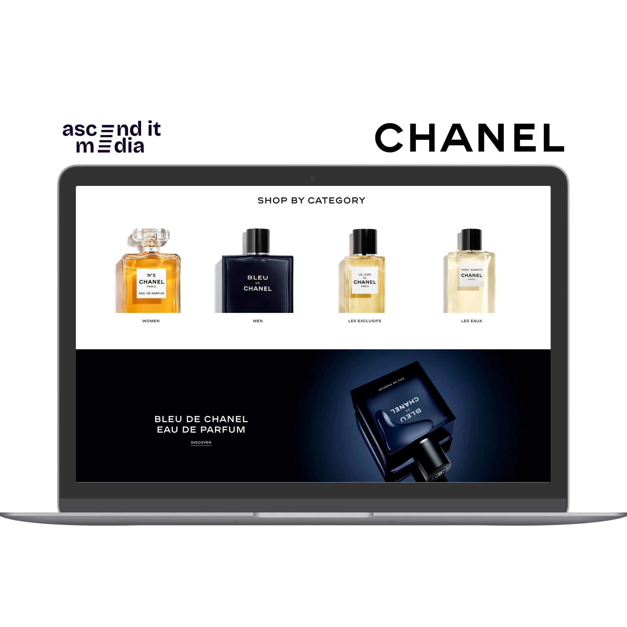
Chanel
Chanel, the iconic fashion house synonymous with luxury and sophistication, understands the importance of visual branding. On their website, Chanel utilizes elegant serif fonts that exude timeless charm and refinement. By adhering to a consistent typographic style across their digital platforms, Chanel reinforces its brand identity and creates a seamless brand experience for its discerning clientele.
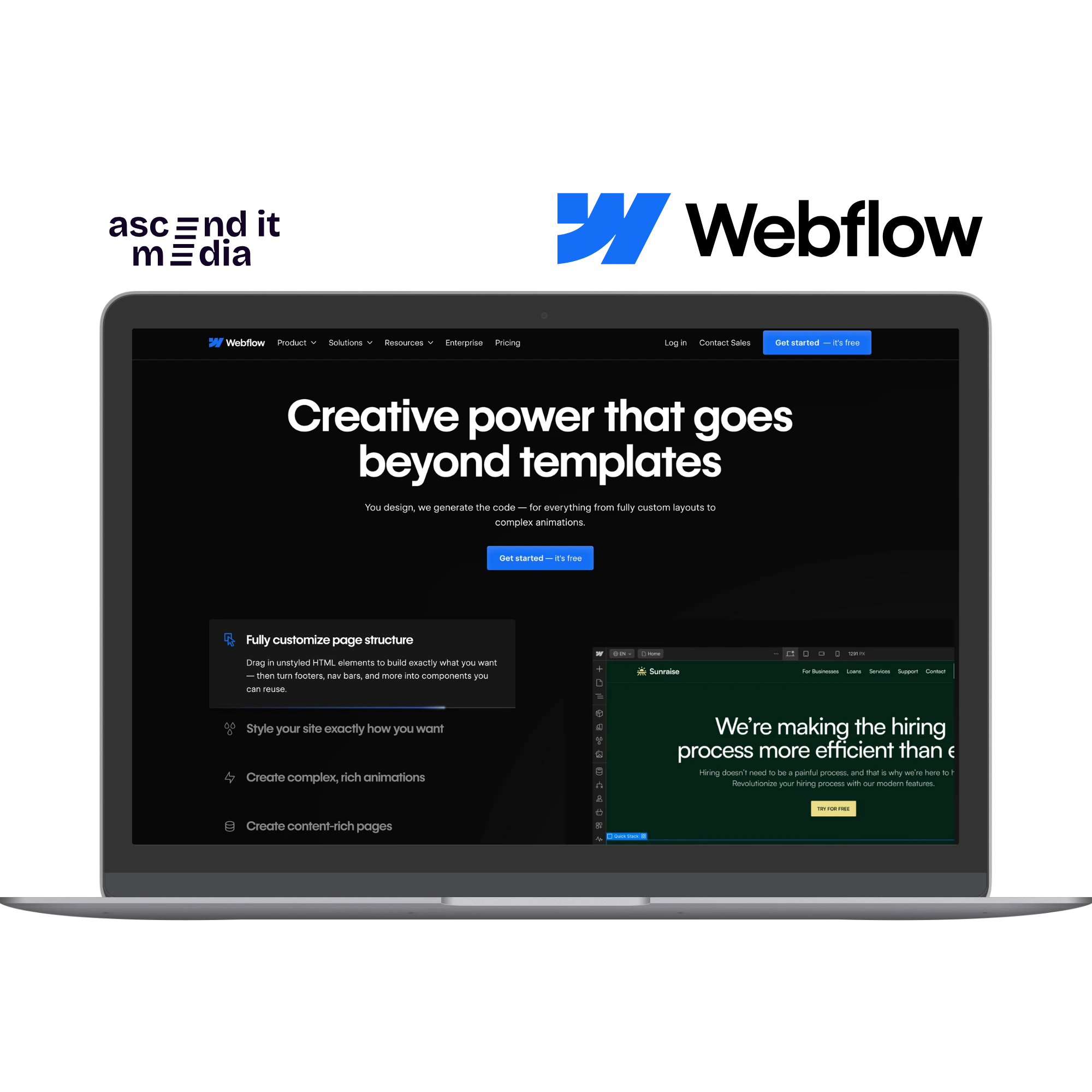
Webflow
As a leading platform for web design and development, Webflow practices what it preaches by prioritizing usability and accessibility in its own website design. With clean and readable fonts, Webflow ensures that visitors can easily navigate their platform and access valuable resources without distractions. By showcasing the effectiveness of user-friendly typography, Webflow sets a positive example for its community of designers and developers.
Tips for Choosing the Right Font
- Prioritize readability: Opt for fonts that are easy to read, especially on smaller screens or low-resolution devices.
- Maintain consistency: Stick to a cohesive typographic style across your website to reinforce your brand identity.
- Consider your audience: Tailor your font choices to suit the preferences and expectations of your target demographic.
- Test different options: Experiment with various fonts and font pairings to find the perfect balance between style and readability.
In conclusion, while fancy fonts might seem appealing at first glance, they often detract from the overall user experience and can undermine the effectiveness of your message. By following the examples set by these five brands and prioritizing simplicity and readability in your typography, you can create a website that not only captures attention but also keeps visitors engaged and coming back for more.